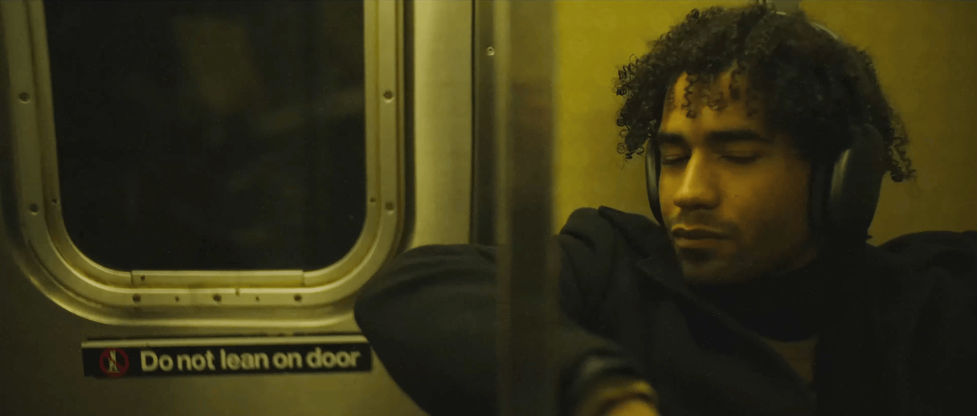
You’ve probably had to deal with muddy colors in your footage like this before.
What’s the reason behind them? Is it incorrect white balance and color temperature? Color casts from lights, like LEDs? In the end, what you really might need is the cleanest, most balanced result. Something that makes the colors really pop out on the screen.
So the question is: what color correction and color grading steps make that possible?
In this tutorial, we’re going to answer that and show several techniques to get rid of unwanted color casts using Color Finale 2 Pro, a color grading plugin for Final Cut Pro.
First example
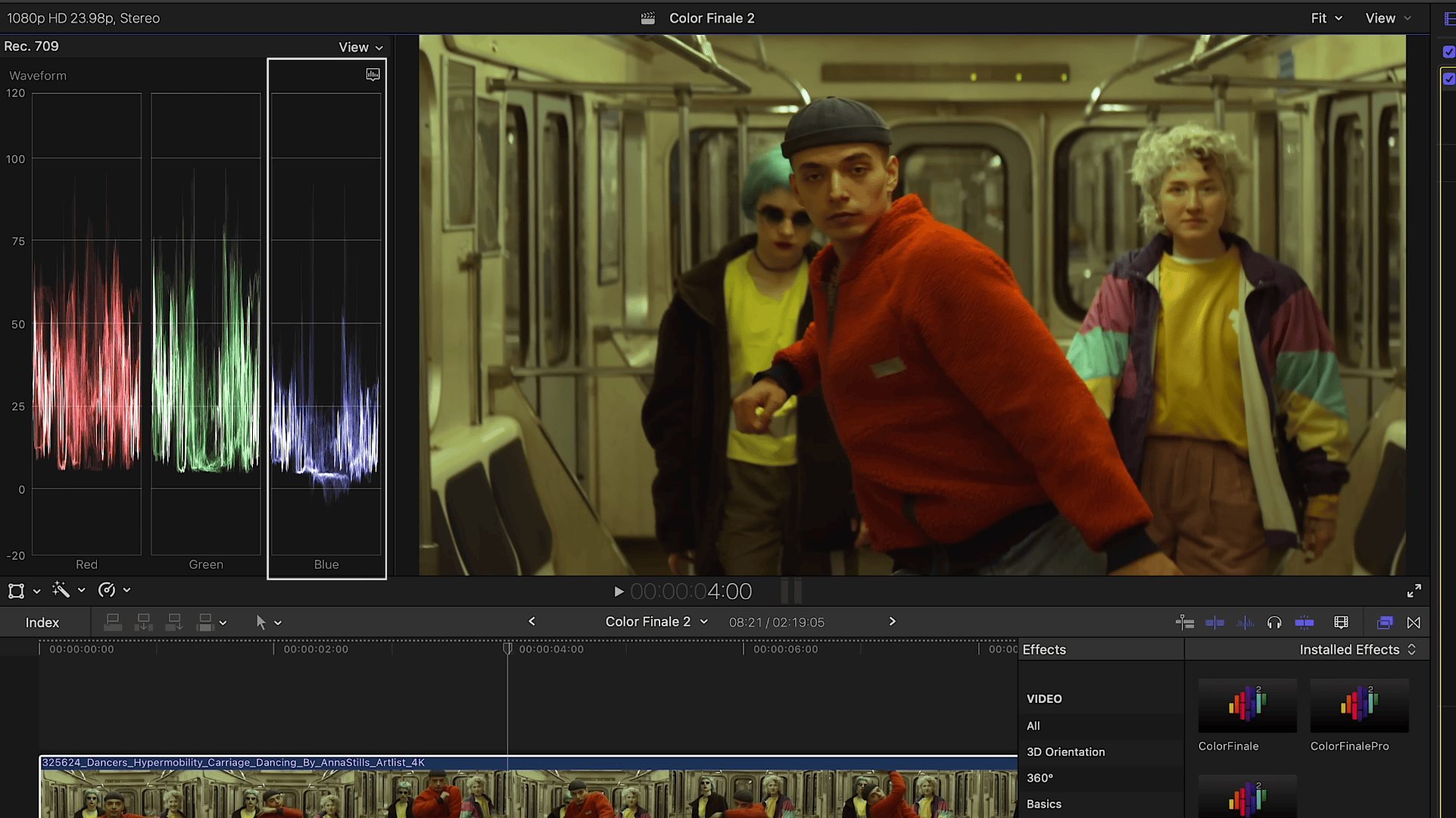
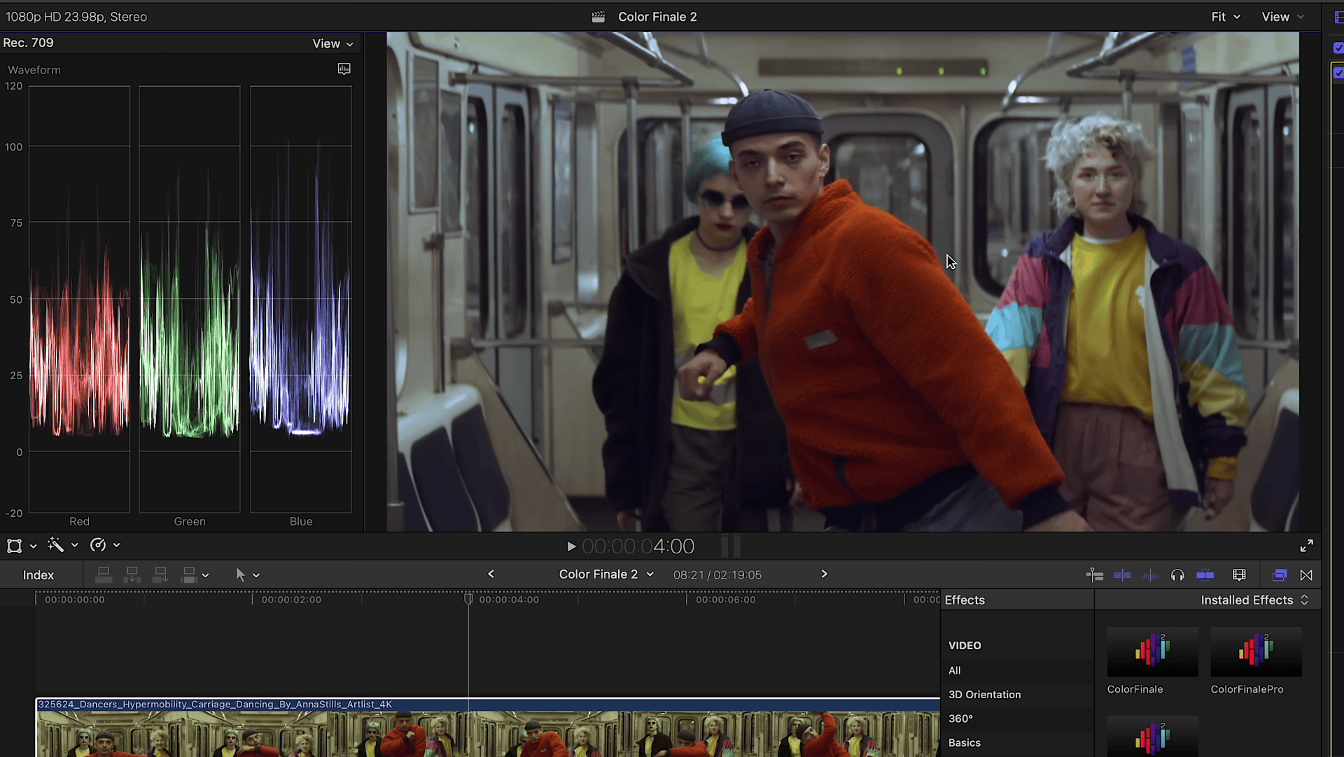
First we analyze what we have by taking a look at the waveform monitor. It should be clear that the image lacks blue for proper color balance.
Let’s move to the Inspector where we can use the White Balance tool to fix that. In the latest 2.13 update, the auto white balance algorithm was improved — automated methods no longer affect the luminosity of the image. Let’s use the eyedropper and see what we get.
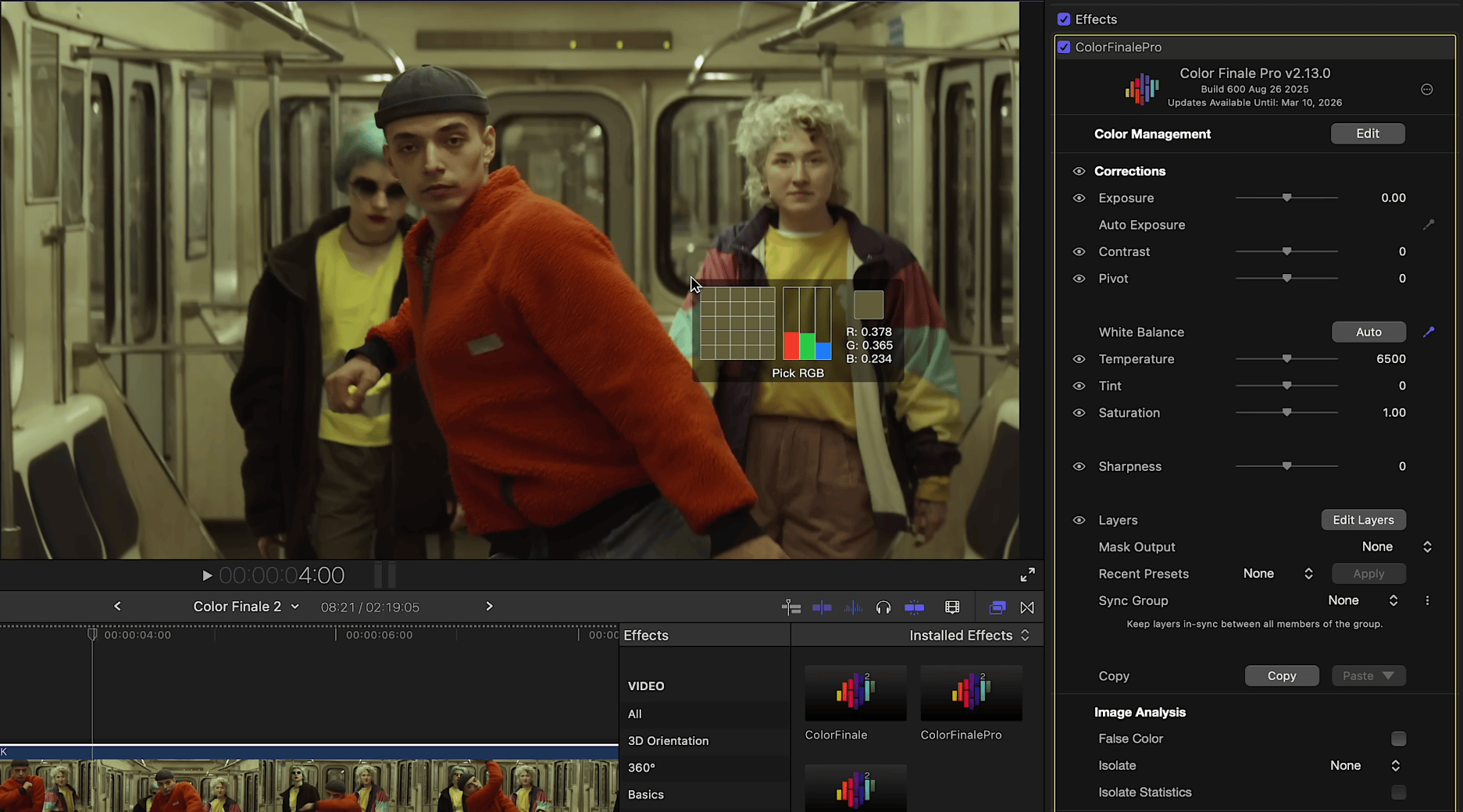
Note that if there’s no color chart, you need to pick as close a color to neutral gray as possible, or something that should by definition be white. The door behind the subjects should definitely be gray. One click — and the footage is balanced. Notice how we’ve eliminated the yellow color cast and the footage looks much cleaner. The waveform monitor confirms this.
Quick and easy!
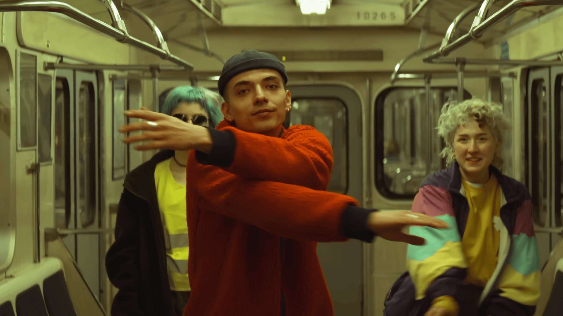
Second example
Now, let’s move to the next example and try another method to bring this footage back to life. Open the Layers panel and add Color Wheels. You may have noticed the color pickers for shadows, midtones, and highlights — they allow automatic correction.
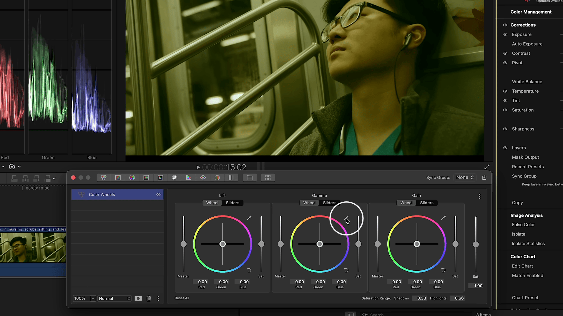
Essentially, it’s auto grading. For balancing highlights, click on something that should be the brightest neutral white. In this case, the lights in the back are a perfect choice. For midtones, choose something neutral gray—like the metallic element of the subway car. For shadows, pick an area that should be dark gray or something similar.
As you can see, we’ve already achieved a solid result. In this case, it works even better to fine-tune the shadows manually since they are almost where we want them. Looking at the waveform monitor, the footage is now balanced and the scene looks neutral—even though initially it had a heavy color cast.
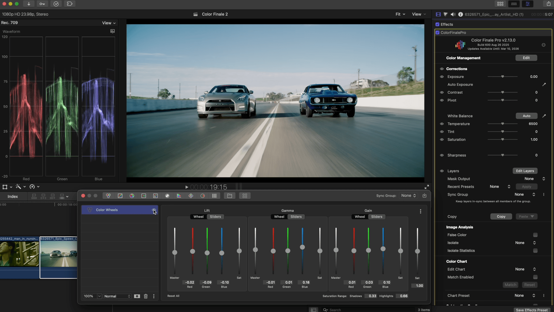
Third example
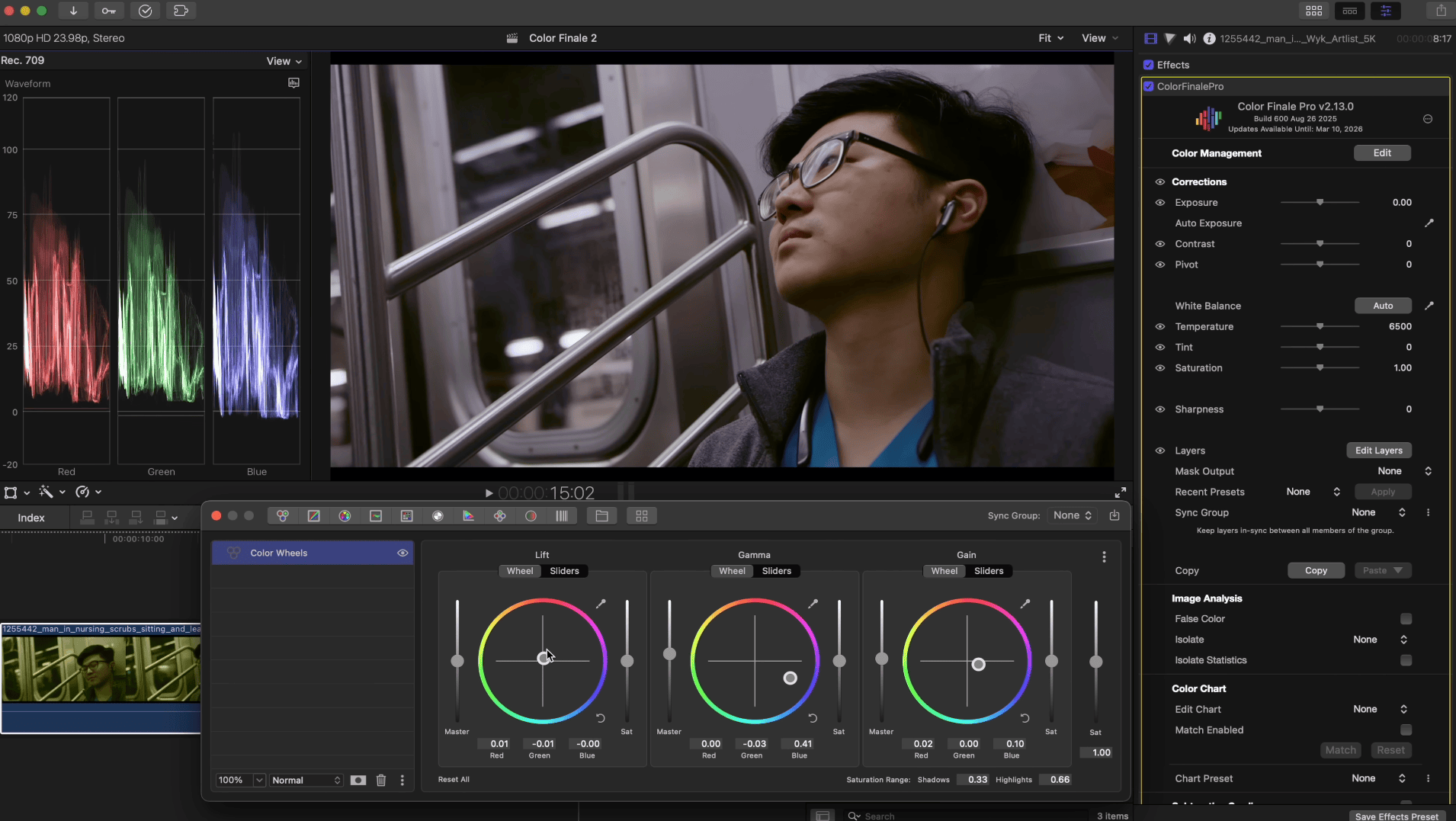
Here’s another example of using Color Wheels, but in a different, more advanced way. Switch the the wheels into their sliders mode by toggling the option above each wheel.
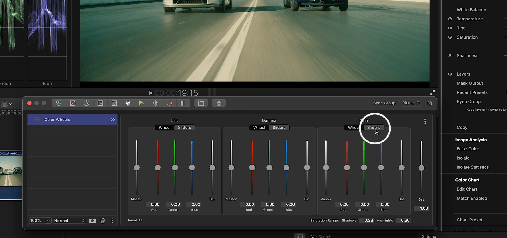
Why use sliders? They allow you to manually balance RGB channels in shadows, midtones, and highlights. At this point it’s best not to adjust by eye, but to instead follow the waveform monitor. As you raise and lower sliders, the goal is to align shadows, midtones, and highlights to match waveforms; in other words, set the same level for a consistent image to achieve a clean look as possible by adding more blue to the highlights and midtones and red to the shadows. Here is the result:
Final example

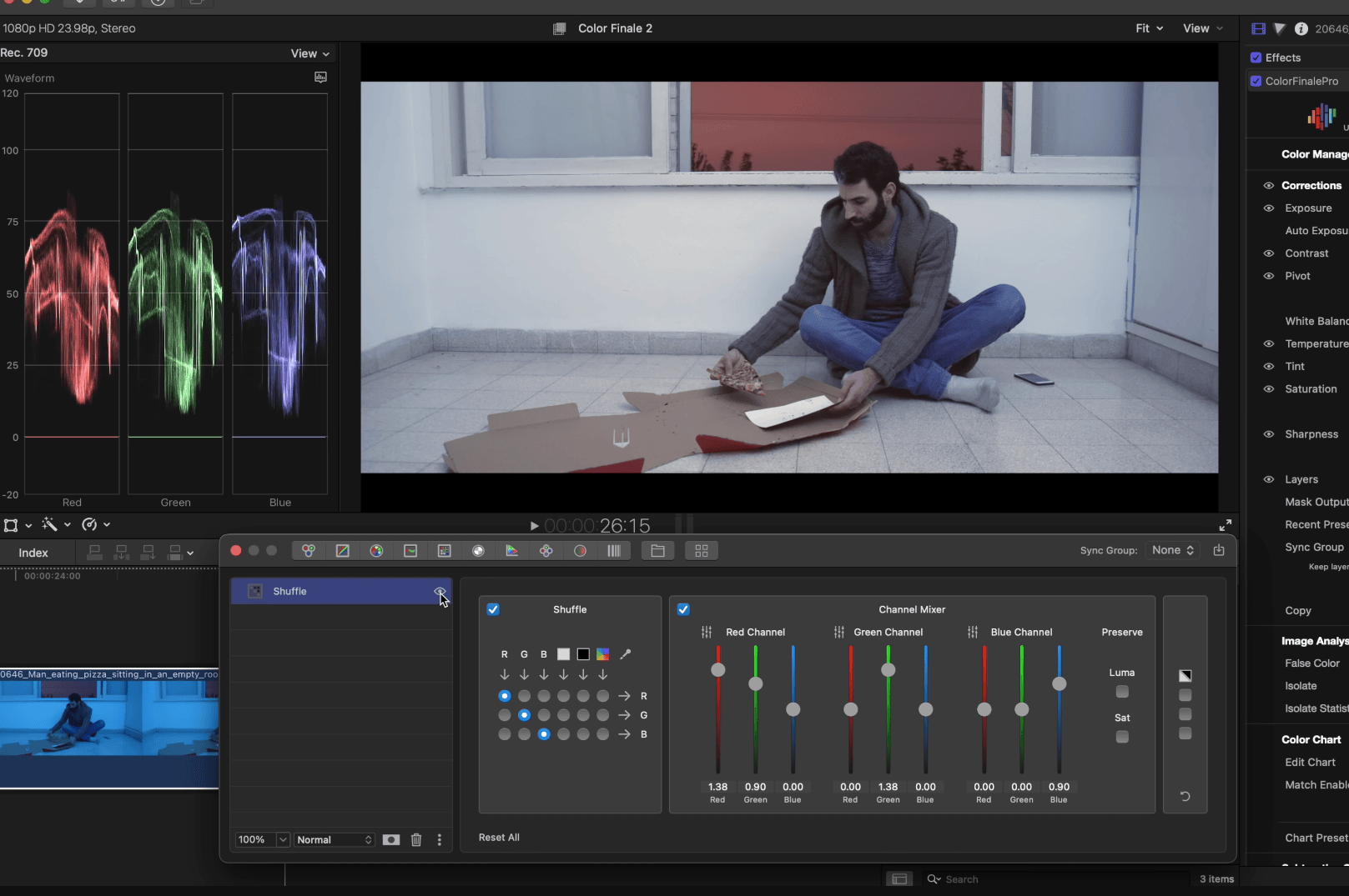
For the final example, let’s look at another tool. The Shuffle Tool is especially good for cases like this.
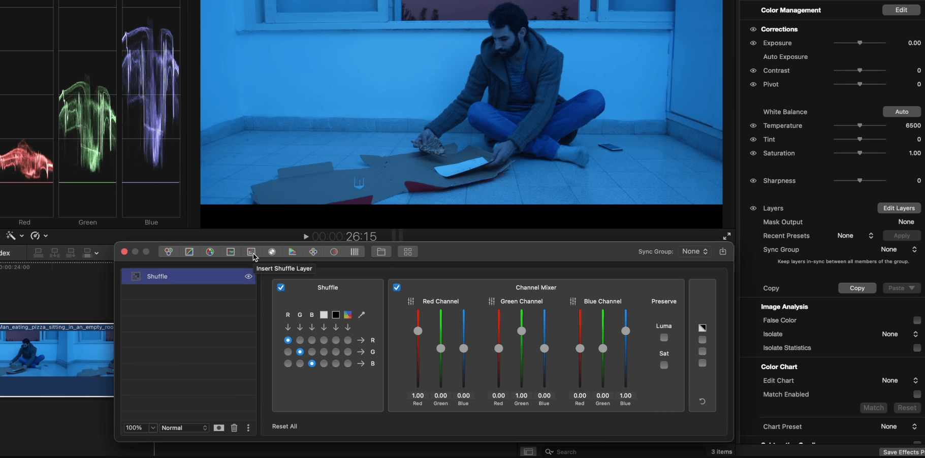
Here, we’ll use only the Channel Mixer. The principle is similar to sliders, but instead of working with shadows, midtones, and highlights, you’re adjusting the amounts of red, green, and blue within each individual channel. Again, guided by the waveform monitor, we start balancing the image. We’ll use the wall as our reference, since it should be neutral white. Since we’ve got a lot of blue we can add more green to the red channel, and slightly add red. Then we added more green to the green channel to balance red and green.
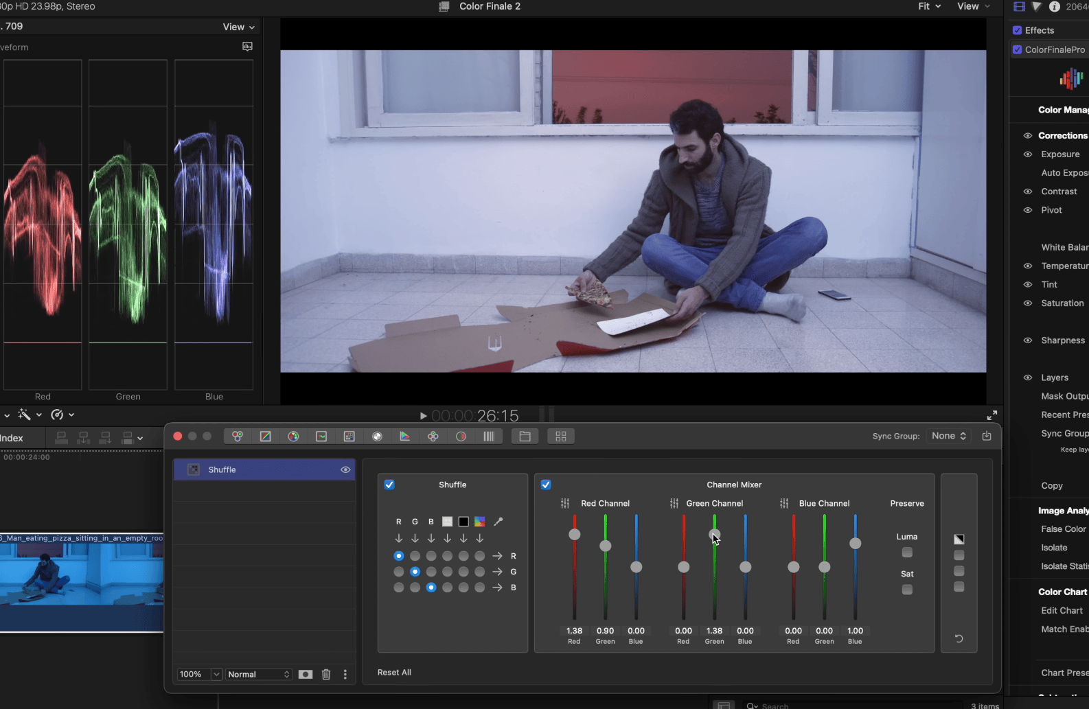
Almost there! The final step to lower the blue in the blue channel. The result is already looking good.
With the balance out of the way, we can add more overall contrast with RGB Curves, as well as boosting the saturation with the addition of another Color Wheels layer. And here’s the final result:

These are only a few of the ways you can modify your footage to suit your creative vision: try everything for yourself with a free 7-day trial of Color Finale 2 Pro. Thanks for reading!